I joined Acast in January of 2026 to help pivot an outdated and disjointed brand feel sleeker, modern, and cohesive. Acast already had a large presence in the European market, but with its new growing market in the US, I was brought on to help bring an American perspective that would help create brand recognition across the world.
Acast had grown exponentially in recent years and its old brand guideline system had reached its limits. This meant creating a new system that could be used across all global markets and be cohesively implemented.
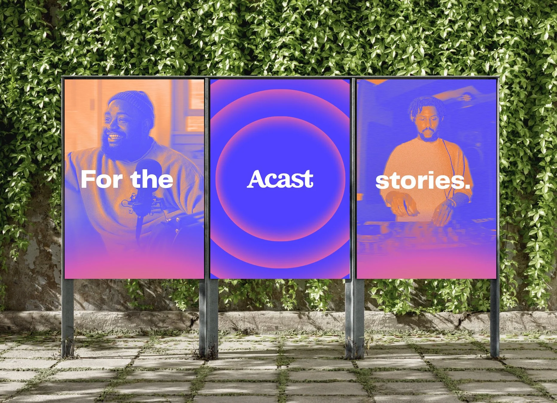
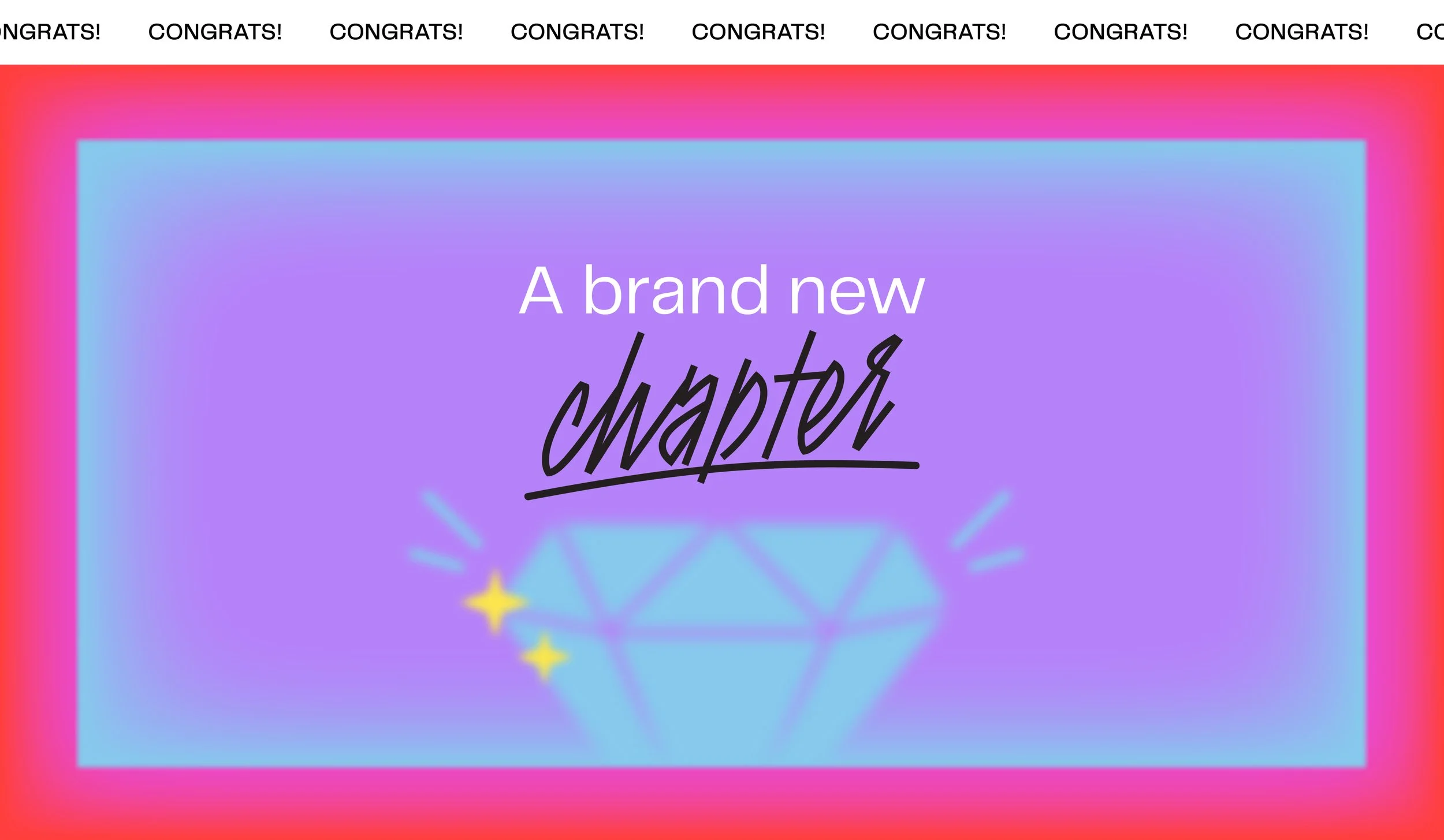
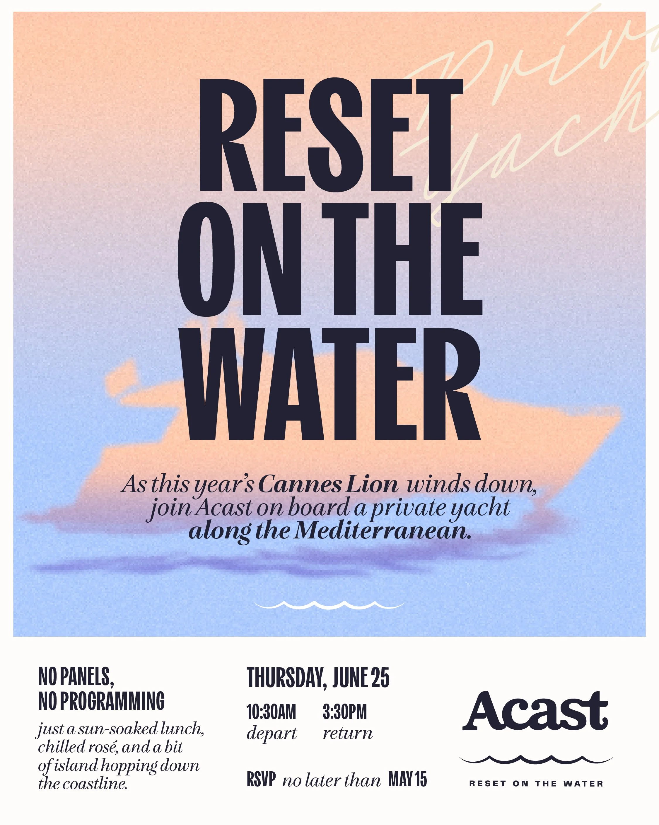
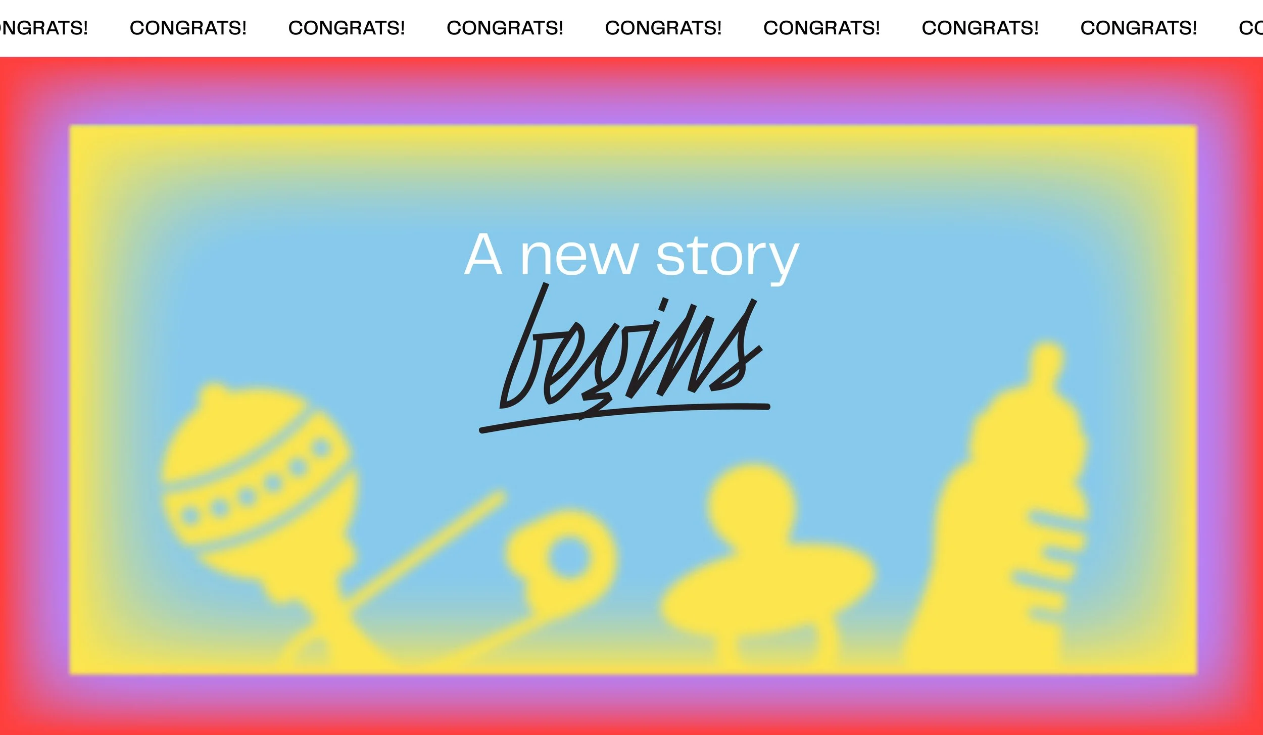
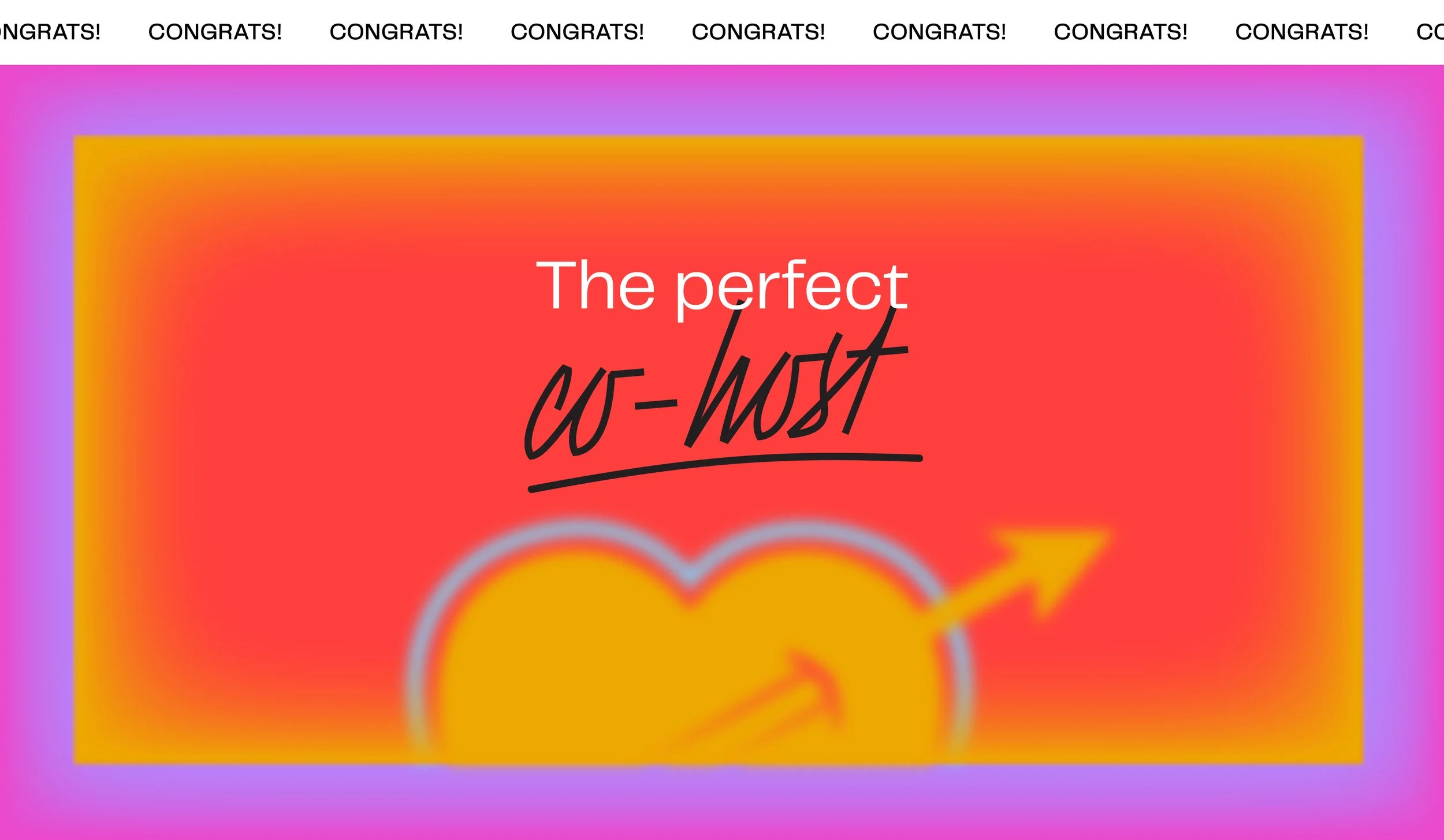
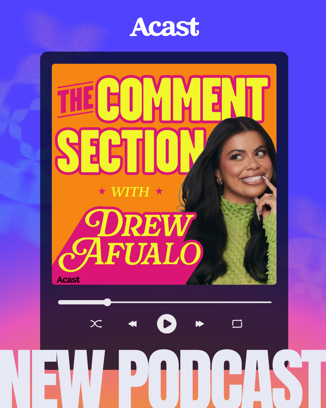
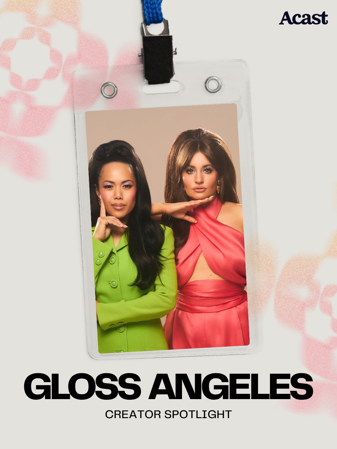
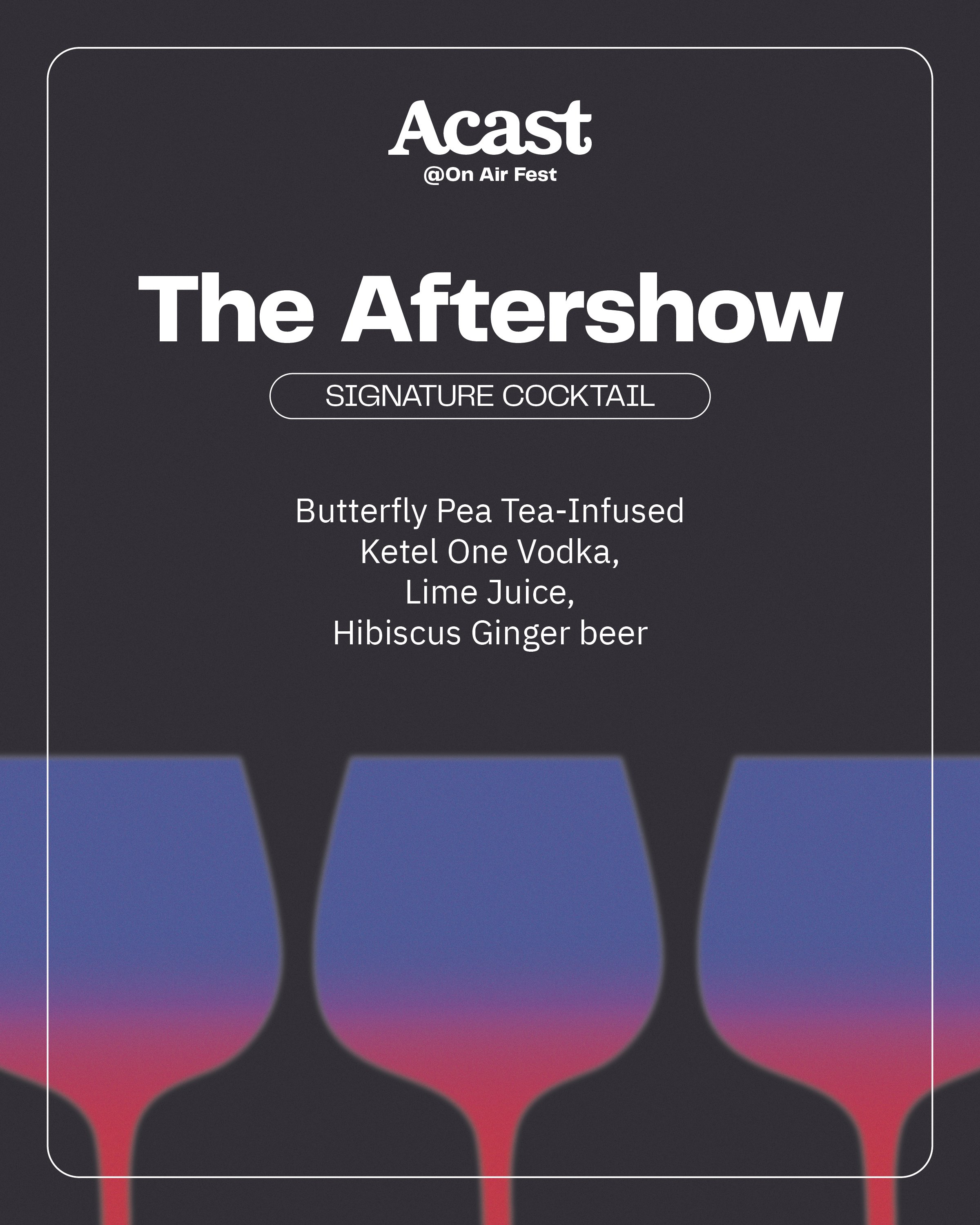
The design overhaul included a new color and gradient system. We kept the signature purple color but moved into a more muted tone for legibility, and added a host of secondary colors to give flexibility across global markets. We expanded upon previous brand elements and added new guidelines across photography and illustration.
Acast Brand Refresh
ROLE: Brand Design | Art Direction
Old brand guidelines



Website
New brand guidelines